Tuesday, August 28, 2018

Art Journal Page 213

Hi everyone!

Today's page was all about using up the leftover paint from my previous page.

All I did was dry brushed the remaining paint onto a lightly gessoed page, then stamped an image and doodled with black & white!

This is a great way to achieve a page with very little effort, especially when creativity isn't being your friend.

You can watch the full process video on YouTube by CLICKING HERE.

Products used:

Liquitex Professional Gesso
Liquitex Basics 'cadmium yellow deep hue' acrylic paint (colour chart)
Liquitex Basics 'primary magenta' acrylic paint (colour chart)
Pebeo 'cerulean blue' acrylic paint
Global Colours 'white' acrylic impasto
Liquitex Basics 'brilliant purple' acrylic paint (colour chart)
Carabelle Studio 'dutch tulips' stamp
Black Sharpie fine point pen
Black uni POSCA paint pen
Faber-Castell black PITT artist brush pen
White extra fine point Sharpie paint pen
White Gelly roll pen
White uni POSCA paint pen
Reeves 'mars black' acrylic paint
Carabelle Studio 'lines pattern' stencil


Thanks so much for stopping by!

Smiles
Jen

Tuesday, August 21, 2018

Art Journal Page 212

Hi everyone!

Once again I'm trying to work out these Dylusions ink sprays! Trying to get them to NOT react when I'm trying to work over the top of them. So a friend asked me whether or not I let the sprays dry and set for 24 hours. Knowing me, I did NOT. So I decided to try this. Thanks Theresa :)

I applied the heavy gesso, let dry, sprayed the Dylusions sprays and let it sit for almost 30 hours!

When I started applying the clear gesso (I think I packed it on too thickly) you could see it reactivating and coming through the gesso. So I let it dry completely by itself overnight - AGAIN - and applied a thin coat of gesso using a brush this time, and it seemed to work fine - fingers crossed!

Once the clear gesso had dried I then started working on the page by applying white gesso sponged over a stencil - YES! Well, it wasn't a BRIGHT white but white enough to make the colours around it pop! Happy days!

You can watch the full process video on YouTube by CLICKING HERE.

Products used:

Generic brand hair spray
Dylusions 'leaf flourish' stencil (stencil discontinued)


Thanks so much for stopping by!

Smiles
Jen

Sunday, August 19, 2018

Blind 3 Colour Challenge Journal Page

Hi everyone!

For today's live stream on YouTube I took the challenge to create a journal page using the 'blind 3 colour' technique.

The 'blind 3 colour' technique means that you can only use the 3 colours you have 'blindly' picked, along with black and white paints. You can also use stencils and stamps, other mediums such as texture paste and gesso.

The three colours I blindly picked were 'oxide chromium green', 'lime green' and 'Naples yellow hue'. I thought this was going to be the day that this technique was NOT going to work, but once I got into it, the page flowed nicely!

And once again this technique worked for me! You should give it a go, it's fun!

You can watch the full process video on YouTube by CLICKING HERE.

Products used:

Liquitex Professional gesso
Reeves 'oxide chromium green' acrylic paint
Semco 'lime green' acrylic paint
Liquitex Basics 'Naples yellow hue' acrylic paint
Reeves 'mars black' acrylic paint
Liquitex Glazing Medium
Stampers Anonymous | Tim Holtz 'attic treasures' stamp set
Stampers Anonymous | Tim Holtz 'bitty grunge' stamp set
Ranger 'jet black' archival ink
Liquitex 'carbon black' acrylic ink
Chromacryl texture paste
Prima Art Basics | Finnabair heavy gesso
Tim Holtz 'speckles' layering stencil
Traci Bunkers 'blind melon' alphabet stamp set
PIGMA black Graphic 1 archival ink pen
Mimi Bondi 'wild flowers' stencil


Thanks so much for stopping by!

Smiles
Jen

Tuesday, August 14, 2018

Art Journal Page 211

Hi everyone!

For today's page I wanted to get back to what I do best (in my humble opinion LOL). I love to create backgrounds but I can't just leave it there. So I think about what the background means to me and I search related images on google. Or I search google first, then base the background on the image. That's what I did today, googled the image first and I'm happy with how it turned out!

You can watch the full process video on YouTube by CLICKING HERE.

Products used:

Liquitex Professional gesso
KaiserCraft 'windsor' stamp
KaiserCraft '36' stamp
Ranger 'deep purple' archival ink
Carabelle Studio 'Libellules & Papillons' stamp
Ranger 'manganese blue' archival ink
Carabelle Studio 'Zinouk hearts' stamp set
Ranger 'rose madder' archival ink
Liquitex Basics 'primary magenta' acrylic paint
Liquitex Basics 'cadmium yellow deep hue' acrylic paint
Liquitex Basics 'brilliant purple' acrylic paint
The Crafters Workshop 'organic matter' stencil
Liquitex Basics 'light blue violet' acrylic paint
Carabelle Studio 'around the world' stencil
The Crafters Workshop 'mariposas' stencil
Pebeo 'cerulean blue' acrylic paint
KaiserCraft 'doily' stencil
Global Colours 'white' acrylic impasto
Liquitex Glazing Medium
Reeves 'mars black' acrylic paint
Dylusions 'heart border' stencil
Paper Craft 'vines' alphabet stamp
Ranger 'jet black' archival ink
Sharpie 'white' extra fine point paint pen
Faber-Castell 'white' PITT artist big brush
POSCA 0.7mm 'black' paint pen
Sharpie 'black' fine point pen
POSCA 1.8-2.5mm 'black' paint pen
Scotch Quick Dry Adhesive
White Stabilo All pencil
Faber-Castell 8B graphite aquarelle pencil


Thanks so much for stopping by!

Smiles
Jen

Sunday, August 12, 2018

Playing With Texture

Hi everyone!

So on my stream today I played around with a technique using texture pastes mixed with various elements. I watched Janet's stream where she played around with the same technique creating backgrounds for use as journal covers.

I took some watercolour paper cut to 5 1/2" x 8" along with a couple of #8 shipping tags and just played.

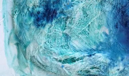
For the first background I applied a thick coat of texture paste and pressed in some cheesecloth, then I randomly applied the same texture paste over the cheesecloth so that it wasn't too dimensional. I then brushed on some pearl turquoise acrylic paint followed by dripping some phthalo green ink and finished it off with some bavarian blue Magicals. It turned out very pretty I thought.

You can watch the live recorded stream by CLICKING HERE.

Products used:

Chromacryl texture paste
Cheesecloth
Jacquard | Lumiere 'pearl turquoise' acrylic paint
Liquitex Professional 'phthalo green' ink
Lindy's Stamp Gang 'bavarian blue' Magicals


For the second piece of watercolour paper I applied Ranger's opaque crackle texture paste and added torn strips of toilet paper into the paste.

I then base coated it all (once dry) with a gold acrylic paint mixed with glazing medium.

Finally I added 'walnut stain' and 'vintage photo' distress reinkers and I absolutely love the colours of this one. I'm thinking I might sand it down and add a coat or two of matte medium over it all and will definitely use this one for the front cover of a journal.

Products used:

Ranger Opaque Crackle Texture Paste
Toilet paper
Brea Reese 'gold' acrylic paint
Liquitex Glazing Medium
Tim Holtz 'walnut stain' distress ink reinker
Tim Holtz 'vintage photo' distress ink reinker


For the third test I took a piece of watercolour paper cut to the size of a #8 shipping tag and applied the opaque crackle texture paste fairly thickly.

I then decided to press in a metal embossing piece into the paste for dimension only as I didn't think the design would show up too clearly.

Once dried I applied a coat of 'raw sienna' acrylic paint over the entire piece of paper.

I then decided to drip some ink onto the piece and used 'indian yellow' and 'phthalo green' inks. I couldn't stop there so I then added some 'magical mai tai' Magicals and dripped some 'walnut stain' distress ink.

I finished it off by applying some 'turquoise' Inca Gold over the high points.

I really love how the Ranger crackle paste works! There are small and large cracks all over the paper!

Products used:


Ranger Opaque Crackle Texture Paste
Nellie Snellen |KARS & Co 'wonderful nature' metal embossing shape
Semco 'raw sienna' acrylic paint
Liquitex Glazing Medium
Daler Rowney | FW 'Indian Yellow' acrylic ink
Liquitex Professional 'phthalo green' ink
Lindy's Stamp Gang 'magical mai tai' Flat Magicals
Tim Holtz 'walnut stain' distress ink reinker
Viva | Inka Gold 'turquoise' metal glass paint


I took another piece of watercolour paper cut to the size of a #8 shipping tag and covered it with light paste and inserted the metal embossing piece.

I then sprinkled over sea salt crystals and set aside to dry.

Once dry I painted some halbein yellow deep watercolour paint all over the background. Once this coat of paint was dry I brushed off all the salt crystals and you can see where every single salt crystal was! It is an amazingly simple texture technique that I love!

I sprayed some 'fully purple' Glimmer Mist over the paper then some 'phthalo green' ink and finally some 'bovarian blue' Magicals.

I'm not a huge fan of the mix of colours here but really love those salt 'indentations'.

Products used:

Art Basics | Finnabair Light Paste
Sea Salt crystals
'Halbein Yellow Deep' tube watercolour paint
Tattered Angels 'fully purple' Glimmer Mist
Liquitex Professional 'phthalo green' ink
Lindy's Stamp Gang 'bovarian blue' Magicals


I did apply some of the opaque crackle paste onto another piece of 5 1/2" x 8" cardstock and applied some heavy gesso to a piece of watercolour paper cut to the size of a #8 shipping tag and inserted the metal embossing piece, but have yet to colour these. I thought I would show you what they look like before working on them anyway.


Ranger Opaque Crackle Texture Paste


Art Basics | Finnabair Heavy Gesso


Thanks so much for stopping by!

Smiles
Jen