My Other Pages

Wednesday, September 19, 2018

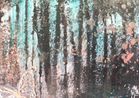
Art Journal Page 216

Hi everyone!

Today I wanted to play with the new paints I bought. That's the only thought I had when I started this page.

Once I got into it I went down the path of working on a background and adding a printed image. I've done this a lot previously and feel very comfortable with this style of journal page.

You can watch the full process on YouTube by CLICKING HERE.

Products used:

Liquitex Professional gesso
Tim Holtz|Stampers Anonymous 'bitty grunge' stamp set
Tim Holtz|Stampers Anonymous 'attic treasures' stamp set
Ranger 'sepia' archival ink
Tsukineko 'cosmic copper' Brilliance pigment archival ink
Americana 'serene' chalky finish acrylic paint
Americana 'timeless' chalky finish acrylic paint
Americana 'vintage' chalky finish acrylic paint
Deco Art 'mink pearl' dazzling metallic acrylic paint
Chromacryl texture paste
Tim Holtz 'lace' laying stencil
Liquitex Basics 'copper' acrylic paint
Prima|Art Basics|Finnabair heavy gesso
Prima 'marquise blue' Artisan Powder
KaiserCraft 'doily' template
Tonic Studios 'fresh copper' nuvo Embellishment Mousse
Graphic 45|Hampton Art 'nutcracker sweet' stamp set
Viva Decor|Inka Gold 'copper' metal gloss paint
Tim Holtz 'vintage photo' distress oxide ink
Tim Holtz 'walnut stain' distress oxide ink
Tim Holtz 'faded jeans' distress oxide ink
Scotch Quick Dry adhesive
Aleene's Tacky Glue
Tim Holtz distressing tool


Thanks so much for stopping by!

Smiles
Jen

Saturday, September 15, 2018

Blind 6 Colour Challenge - A Fail?

Hi everyone!

So for today's blind 6 challenge Eileen told me I had to use embossing powder as one of my 6 products after watching my latest video on YouTube and how I made it hard for myself LOL.

So the products I blindly chose were 'teal' acrylic paint, ''fresh copper' nuvo embellishment mousse, 'fossilized amber' distress oxide, 'cocklebells coral' starburst spray, 'silver' embossing powder & 'bavarian blue' Magicals powder.

So instead of just applying the teal on its own for the first layer I decided to use black with it - seemed like a big mistake as I was then trying to lighten it the whole way through to the end. It turned out okay, just not a huge fan of it. I ended up recreating it using the white instead of the black and you can see the difference between the two below in the pics. I think I prefer the black as it has more depth to it
.

You can watch the full process video recorded live with chat on YouTube by CLICKING HERE.

Products used:

Canson Mix Media 165g (98lb) paper
Reeves 'teal' acrylic paint
Reeves 'mars black' acrylic paint
Reeves 'titanium white' acrylic paint
Liquitex Professional gesso
Tim Holtz 'string' layering stencil
Tonic Studios 'fresh copper' nuvo embellishment mousse
Tim Holtz 'speckles' layering stencil
Tim Holtz 'fossilized amber' distress oxide
Lindy's Stamp Gang 'cocklebells coral' starburst spray
The Crafters Workshop|Karen Ellis 'whimsical vines' stencil
The Crafters Workshop 'mini botannicals' stencil
KaiserCraft 'butterfly' template
Chromacryl texture paste
Lindy's Stamp Gang 'bavarian blue' Magicals powder
Sheena Douglass 'A Little Bit Scenic' stamp set (used butterfly)
Studio 'black' permanent marker


Thanks so much for stopping by!

Smiles
Jen

Tuesday, September 11, 2018

Art Journal Page 215

Hi everyone!

I wanted to play with my distress inks today because ever since I've bought the distress oxide inks I have ignored them completely! I wanted to see how a large background would look using just distress inks. So I really had fun creating the background and it looked so soft that angels and mermaids came to mind. I knew I had a mermaid stencil - just one, and I knew I had either stamps or stencils with wings, hence the mer-angel!

Then I had to go and use embossing powder, didn't I! I curse the mess every time I use it but never remember until it's too late and I have a huge mess of embossing powder everywhere! Just as well the end result is worth it LOL.

You can watch the full process video on YouTube by CLICKING HERE.

Products used:

Liquitex Professional Gesso
Tim Holtz 'scattered straw' distress ink
Tim Holtz 'victorian velvet' distress ink
Tim Holtz 'milled lavender' distress ink
Tim Holtz 'rusty hinge' distress ink
Tim Holtz 'squeezed lemonade' distress ink
Tim Holtz 'worn lipstick' distress ink
Tim Holtz 'aged mahogany' distress ink
Tim Holtz 'tattered rose' distress ink
The Crafters Workshop 'fairywings' stencil
Chromacryl texxture paste
Ranger 'queen's gold' embossing powder
Ranger Emboss-it clear embossing pen
StencilGirl® 'mermadia' stencil
Semco 'burgandy' acrylic paint
Jacquard 'pearl white' Lumiere paint
Ranger Stickles
White POSCA paint pen
Gold gelly roll pen
White gelly roll pen
Heidi Swapp 'confetti' stencil
Dylusions 4 1/4" x 12" journal block
Duramax painters tape


Thanks so much for stopping by!

Smiles
Jen

Saturday, September 8, 2018

Blind 6 Colour Challenge - Purple Rain

Hi everyone!

So on today's live stream on YouTube I created a journal page based on the blind 6 colour challenge.

Blind 6 means that I blindly pick one of 6 mediums/products and create a page based on those picked, along with being able to use other mediums such as gesso, texture paste, stencils as well as black and white products. Black and white are not classed as 'colours'.

The products/mediums I blindly chose are listed below in the products used.

You can watch the full live stream recording on YouTube by CLICKING HERE.

Products used:

Liquitex Professional gesso
Reeves 'violet' acrylic paint (blind picked)
Golden gesso
Liquitex 'phthalocyanine green (blue shade) ink (blind picked)
Adirondack 'sunset orange' Color Wash (blind picked)
Tim Holtz 'aged mahogany' distress stain (blind picked)
Lindy's Stamp Gang 'bavarian blue' Magicals (blind picked)
Tim Holtz 'mermaid madness' distress oxide (blind picked)
Fiskars circle template
Tim Holtz 'stripes' layering stencil
Tim Holtz 'bubbles' layering stencil
Chromacryl texture paste
Portfolio 'black' water soluble oil pastels
Fiskars 1/4" hole punch
Chipboard/cardstock alphas from my stash
Scotch Quick Dry Adhesive


Thanks so much for stopping by!

Smiles
Jen

Tuesday, September 4, 2018

Art Journal Page 214

Hi everyone!

Today I decided I wanted to see how sprays would work on a non-gessoed surface and how it compared to a gessoed surface, so I used the Dylusions black Creative 8"x8" journal and gessoed the left hand page, no gesso on the right hand page. I used Heidi Swapp sprays for this experiment and I must say I like both results!

I love the muted colours and the patterns the sprays made on the non-gessoed page (right side). I must admit I was very surprised that the colours didn't come up through the texture paste as much as I thought they would.

The left hand page, which had the black gesso applied first, was more vibrant than the non-gessoed page. The patterns were pretty and the sprays didn't really come through the texture paste but I think they were more apparent on the gessoed page. I'm assuming this is because the sprays would have soaked through on the non-gessoed page and therefore weren't sitting on top waiting to absorb into something.

So the upshot is - there's pros and cons for using sprays with or without sprays LOL. Have fun!

You can watch the full process video on YouTube by CLICKING HERE.


Products used:

Heidi Swapp 'sweet mint' Color Shine
Heidi Swapp 'patina' Color Shine
Heidi Swapp 'citron' Color Shine
Heidi Swapp 'butter' Color Shine
Heidi Swapp 'gold' Color Shine
Chromacryl texture paste
Tim Holtz 'flourish' layering stencil
KaiserCraft 'stencil words' stencil
Liquitex Professional gesso
Derivan Matisse 'folk black' coloured gesso


Thanks so much for stopping by!

Smiles
Jen